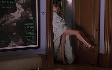
Why This Blue Shows Up in So Many Hollywood Movies
There’s one shade of blue that keeps showing up in Hollywood movies — again and again.
It appears on walls, doors, trim, in bedrooms, home offices and living rooms, and somehow it does something almost magical to an interior: it adds depth and visual context. Even though it’s just paint.

This color is a dusty blue, close to what’s often called French Blue. It isn’t naive and clear like a summer sky. It’s a blue that already seems to have a story behind it — memories, dreams, a little emotional patina.
And that’s exactly why set decorators love it. It instantly makes a space feel lived-in.
The color is Soft Jazz 709 by Benjamin Moore. In some movies, the shade has been identified by the designers themselves — as in the case of Sex and the City. In others, the color is close enough that Soft Jazz is the prime suspect.

Benjamin Moore describes it as a cornflower blue with a soft, quiet character. Its LRV is relatively low at 37, which means this isn’t an airy baby blue. It’s deeper, dustier, and much more atmospheric.


You may have seen it in Sex and the City — Carrie Bradshaw’s famous dressing room is painted in this color, as well as in The Intern (one of the most beautiful movie interiors ever), Sofia’s bedroom in Vanilla Sky, Serena’s spaces in Gossip Girl, old-school rom-coms like 13 Going on 30, and newer movies like The Housemaid. And this is nowhere near a complete list.

Once you know what to look for, you’ll probably start spotting this color in movie interiors everywhere. It looks slightly different depending on the lighting and final color grading, but you know it when you see it.
So let’s talk about why this particular blue has become such a favorite among set decorators.
IT’S NOTICEABLE, BUT MUTED
This color has one extremely useful quality for film: it gets noticed without shouting for attention.
That makes it perfect for creating an accent without making an interior feel extravagant.
Have you noticed how often this kind of blue appears on trim, window frames, or a single wall?
It gives the architecture a little more personality without taking over the entire room.


IT DOESN’T COME WITH A READY-MADE ASSOCIATION
Take a clean baby blue. It starts telling you a story pretty quickly: nursery, bathroom, ocean, something else very specific. It already comes with a whole set of associations. This blue is much more complicated.
It reminds of a linen shirt, faded vintage denim, and blue-and-white antique ceramics somehow blended into a single color. Not literally those things — more like the memory of them.
Something half-remembered. Dreamlike. A little nostalgic. And that makes it incredibly useful in movies, where an interior often needs to suggest a whole life without explaining anything.

IT MAKES SKIN LOOK FRESHER
Against a muted blue, skin tends to look warmer and faces become more expressive.
It works especially beautifully with natural daylight, wood furniture, warm textiles and creamy neutrals.
Which is why you’ll often see this color in close-ups. The room quietly steps back, and the face comes forward.

SIMILAR SHADES
Soft Jazz isn’t some magical formula, like a perfume composition. It’s less a one-of-a-kind color than a member of a much larger family of cinematic dusty blues.
If you want that same movie effect — not simply blue, but a blue that feels dusty, complex and slightly gray, the important thing is to understand the quality you’re looking for. Once you do, you’ll find plenty of similar paints.

Benjamin Moore has several shades with a related feeling, including Blue Nova, Van Cortlandt Blue, and Buckland Blue.

At Sherwin-Williams, look at Stardew SW 9148 and Misty SW 6232. At Behr, there’s Light Drizzle.
On a real wall, they’ll look completely different depending on the light, flooring, furniture and surrounding colors. The same is true in movies: every room has its own light, and then there’s the final color grade. Even the exact same color in Carri e’s dressing room looks slightly different across different seasons of Sex and the City.


Because the most important thing here isn’t the exact color formula. It’s the dustiness, melancholy and ambiguity. This paint doesn’t say, “Here is the accent wall.”
It says: “People dream here. People talk here. There are things worth remembering here.”
And honestly, for a movie, that’s a pretty powerful line, especially when it’s being delivered by nothing more than a wall.